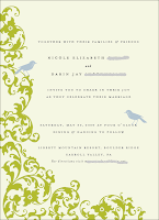
Okay, soooo I am super excited to share some rough drafts of the invitation!! Below are just a few options Teresa sent my way! We are still playing around with color...fonts...sizes..etc...I'm thinking I want our names to be in a fancy font... Any sweet comments or suggestions welcomed!
Please give design credit to: Teresa VanWagner


4 comments:
1-3 are my favorites! they look great and i totally agree with you about putting your name ion a fancy font! yay!
Green background, blue birds...Love it! Maybe make the font different and a bit larger for your names. Wonderful job!
I love 1&3. I would use a fancy font and make your names bigger so they stand out. Those birds are too cute! gotta have them!
The 3rd one is my favorite. I think it looks classy
Post a Comment